Monday, November 10, 2008

Star Plot


Above are Star plots of 1979 Automobile analysis.

Correlation Matrix


A correlation matrix lists the variable names down the first column and across the first row. The diagonal of a correlation matrix always consists of ones. In every correlation matrix there are two triangles that are the values below and to the left of the diagonal and above and to the right of the diagonal. A correlation matrix is always a symmetric matrix.

Similarity matrix


A similarity matrix is a matrix of scores which show the similarities between two data points. They are generally used in sequence alignment. The higher the score the more similar characters it receives.

Stem & Leaf Plot


Stem and leaf plot is a way to show quantitative data in a graphical format to help visualize the distribution among categories. It came about from teh work of Arther Bowley in the early 1900's.

Box Plot


Above is a Box plot of total metric scores for 1995.

Histogram


Above is a Histogram of the "Departure of Fcst UVI from Obs UVI".

Parallel coordinate graph


Above is an example of Parallel coordinate graph

Triangular Plot


The Triangular plot above shows the estimated fraction of the population intending to vote for each of the major parties
http://ex-parrot.com/~chris/images/20050407/triangle.png

Windrose


Above is a Windrose showing the relative frequency of directions from where the wind is coming from.

Climograph


Above is a Climograph of showing temperature and rainfall per month.

http://arsc.arid.arizona.edu/migratory/case_studies/mazatlan-climograph.jpg

Population Profile


Above is a Population profile illustrating the population profile for Australia's Northern territory from 1986-1995.
http://www.nt.gov.au/ntt/financial/9697bps/bp6/gifs/ch1f4.gif

Scatterplot


Above is an example of a Scatterplot "showing wife age as a function of husband age.

http://cnx.org/content/m10949/latest/age_scatterplot.gif

Index Value Plot


Above is an example of an Index value plot is "of Average Streamflow Index, plotted as the red line on the above graphs, is calculated each day as the average of the streamflow index values for all the stream gaging stations in the state or water resource region having at least 30 years of record".

Accumulative line graph or Lorenz


Bilateral graph


Above is a Bilateral graph of the trends in bilateral tied aid.

Nominal Area Choropleth


Above is an example of a Nominal area choropleth map of the "California % Black Condo Owners".

Unstandardized Choropleth


Unstandardized Choropleth

http://www.epa.gov/oppt/rsei/images/thematic.jpg

Standardized Choropleth


Map of the world's population density.

Univariate choropleth map


The percentage mean for each states electoral votes for the 2004 presidential election. This map may also be considered a propaganda map.

http://www.cartisan.com/map_resources/map_types/images/choropleth.jpg

Bivariate Choropleth Map


U.S. Olympic Athletes' home areas, based on high(darker shades) or low (lighter shade) per capita and winter(blue) and summer(red) olympic athletes.

Unclassed choropleth map


This technique assigns shadings proportional to the data values so that these choropleth maps do not have to classify the data. This method of mapping has not been generally accepted because many cartographers claim that they lose the ability to direct the message of communication.

http://www.agocg.ac.uk/reports/visual/casestud/dykes/figure9.gif

Classed Choropleth Map


Above is a Classed Choropleth map of Percentage of individuals living in poverty, by county in the United States in 2000.

Range graded proportional circle map


The Range graded proportional circle map above is of river characteristics discovered during the Lewis and Clark expedition.

Continuously variable proportional circle map


Continuously variable proportional circle map

DOQQ


The Mission Bay SE DOQQ is located along the southeast portion of the Texas Gulf Coast within the San Antonio - Nueces Coastal Basin.

DEM


This dataset is a 30 meter digital elevation model of the seven county Twin Cities metropolitan area. The data represent an elevation surface of the TCMA in a regular grid where each grid cell is a 30 meter by 30 meter square with a single elevation value for each cell given in feet above mean sea level.

DLG


The following DLG data have been mosaicked together from the18 7.5-minute quadrangles that cover the Lake Tahoe Basin.

http://tahoe.usgs.gov/images/4ds/dlg_zoom.gif

DRG


DRG
The following DRG data have been mosaiced together from the 18 7.5-minute quadrangles which cover the Lake Tahoe Basin.

http://tahoe.usgs.gov/images/4ds/drg_zoom.gif

Isopleth


Isopleth Map and description included above.

Isopach


Thickness of the Tebo coal ranges in thickness from 0 to 3 feet with an average of 0.9 feet and a distribution slightly skewed to the minimum (0 to 1 m, average of 0.3 m). Isopach mapping of the Tebo coal reveals a coal that stays fairly consistent in thickness over an average of 5 miles.
http://www.kgs.ku.edu/PRS/Coal/gifs/tebo-SM.jpg

Isoheyts


Isohyets are contour lines that connect equal bands of rainfall. This map taken from the Hong Kong Observary shows the variance in the rainfall levels throughout the city.

Isotachs

An example of Isotachs over the western United States.
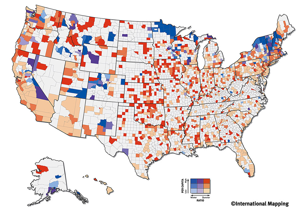
Isotachs are contour lines that display points of equal wind velocity.
http://www.wrh.noaa.gov/wrh/SLCw38.jpg

Isobars


Above is an example of Isobars showing the different levels of air pressure above Australia.
Isobars are illustrated by contour lines which display the different levels of air pressure in the atmosphere; these maps are used as part of the weather predicting process.

http://www.weatherchannel.com.au/images/small/National_Isobars_06.jpg

LIDAR


LIDAR is the technology of using pulses of laser light striking the surfaces of the earth and measuring the time of pulse return.

Doppler Radar


Doppler Radar
Above is a Doppler Radar image taken on July 2003 of Hurricane Claudette making landfall in Houston, TX.

Tuesday, October 21, 2008

Black and white aerial photo


Aerial photographs, or printed versions known as photomaps, are found in many portions of the collections such as the Edgar Tobin Aerial Surveys Collection and the Nirenstein National Reality Company Collection. Many World War II era maps filed in the general collections are in the form of photomaps because they could be produced rapidly by tactical mapping units in the field to support military actions on the ground and for the identification of bombing targets.

http://www.loc.gov/rr/geogmap/guide/gmillapa.html - Library of Congress

Wednesday, September 17, 2008

Infrared Aerial Photo


Infrared photos are exceptionally well suited for detecting unusual and extreme environments.

Cartographic Animations


An animated map. In this case depicting the percent of births to Mothers under age 20.

Statistical Map

Statistical Map
Maps to define areas based on the metropolitan area concept.
Throughout the period 1910 through 1940, the Census Bureau defined metropolitan districts in terms of minor civil divisions (MCDs)—county subdivisions such as townships or election districts—and determined their boundaries primarily based on population density.

Cartograms


Cartograms

A diagrammatic map on which statistical information is represented by shading and symbols. A cartogram is a map on which the area of each division is proportional to some value other than its land area. This Cartogram is depicting Electoral Votes for 2004.

Flow Map


Flow Map

Flow maps show the movement of objects from one location to another.

Isolines Map


It easily shows the distribution of the subject matter. In this case it is the temperatures.

Wednesday, August 27, 2008

Proportional Circle

Proportional Circle

Proportional circle maps display data in relation to the size of the circles. This map depicts homes built before 1940.

Tuesday, August 26, 2008

Choropleth Map


Choropleth Map

This choropleth map shows the percentage of Hispanic population per county in Florida based on Census data from 2000. Choropleth Maps are thematic maps based on predefined aerial units.

http://www.ilstu.edu/~jrcarter/Geo204/Choro/Tom/

Dot Distribution Map


Dot Distribution Maps are useful to help show populations. Here shows the population of military families and where they live in relation to the state.

Propaganda Map

Propaganda Map

Often used in war time to paint the picture of superiority. The true definition is Material disseminated by the advocates or opponents of a doctrine or cause: wartime propaganda.

Hypsometric Map

Hypsometric Map

Hypsometric maps represent the elevation of the terrain with colors. The area between two neighboring contour lines receives one specific tint.


Monday, August 25, 2008

PLSS Map

PLSS Map

The Public Land Survey System (PLSS) is a way of subdividing and describing land in the United States. All lands in the public domain are subject to subdivision by this rectangular system of surveys. The Bureau of Land Management (BLM) is responsible for regulating and maintaining the PLSS.

Thematic Map


American Indians and AlaskaNatives - Thematic maps are data maps of a specific subject or for a specific purpose. Statistical thematic maps include a variety of different map types such as choropleth or shaded maps, dot maps, proportional symbol maps, and isarithmic maps.

Wednesday, August 20, 2008

Cadastral Map

Cadastral Map
A legal map for recording ownership of property. The map describes boundaries and ownership.Example: Tax assessors in some jurisdictions use a cadastral map to be certain that no property escapes taxation.